Design an Ideal Dashboard for Your Sales Team
Reports and dashboards serve as invaluable tools for Salesforce admins to transform data into actionable insights. I’ve come across numerous anecdotes from admins who have created impactful dashboards, impressing their leadership and eliciting enthusiastic responses. Admins have displayed reports and dashboards that track various key performance indicators (KPIs), enabling their organizations to make informed decisions and positioning themselves as trusted partners in driving success.
Data analysis is a fundamental skill for Salesforce admins, and it forms an integral part of our Salesforce Admin Skills Kit. In this article, we will delve into the basics of reports and dashboards, equipping you with the knowledge to master analytics within the Salesforce ecosystem.
Report versus dashboard
Before building a dashboard, it is necessary to create a report. A dashboard comprises charts extracted from reports and allows users to modify filters and how the data is displayed. However, the report serves as the foundation layer that organizes and sorts the data to be displayed. Although not all reports require a dashboard, it is recommended to present every report on a dashboard. This is because users may find the functionalities of the report builder overwhelming. By placing a report on a dashboard, it is easier to interpret the insights presented by the report.
To create a powerful sales dashboard, let’s explore some simple reports that can be incorporated into the “Sales Team Ideal Dashboard.” For a more detailed learning experience, refer to the excellent learning resources on Trailhead.
Sales Team Ideal Dashboard
Before embarking on any project, it is essential to establish a clear goal. As #AwesomeAdmins, we excel at asking pertinent questions to understand the needs of our stakeholders and leveraging Salesforce to meet those needs.
Prior to constructing a dashboard, it is crucial to inquire about various aspects, such as the organization’s key performance indicators (KPIs), the intended use of the data, the intended audience for the dashboard, and the cleanliness and currency of the data. Once we have a comprehensive understanding of the goal, we can proceed with building the necessary components, starting with reports.
Upon discussing the KPIs with the sales team, we discover their current focus revolves around gaining a comprehensive overview of their sales figures, both past and projected. They are particularly interested in identifying accounts with substantial sales opportunities and addressing any gaps in regional sales coverage. Their objective is to allocate investments wisely, focusing on areas with lower sales performance, while also gaining insight into their revenue generation and timing.
To meet these requirements, we need to construct reports that track opportunities, highlighting key data points such as the amount, close date, status, expected revenue, region, and lead source. These reports should be organized in a manner that empowers the sales team to derive actionable insights and make informed decisions.
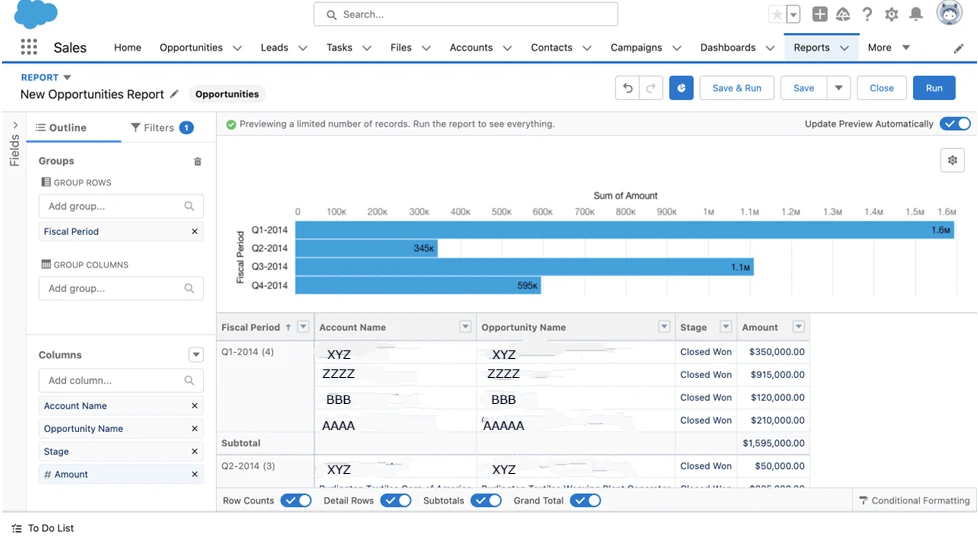
Now, let’s begin by constructing a report that displays closed opportunities, grouped by fiscal quarter, and sorted by amount and close date.
Steps:
- Select the Reports tab, then click the New Report button.
- Select the Opportunities report type, then click the Start Report button.
- Click the Filters tab in the report builder, and change these filters: Show Me – All Opportunities, Close Date – All Time, Opportunity Status – Closed Won.
- Click the Outline tab in the report builder, and remove the unnecessary columns by clicking the “x” to the right of the column names you don’t need so that only Account Name, Opportunity Name, Amount, Close Date, and Fiscal Period display.
- Click the drop-down arrow on the Fiscal Period column header, and select Group Rows by This Field.
- Click the drop-down arrow on the Amount column header and select Summarize – Sum.
- Click the Add Chart button near the top of the page and select Bar, give it a title, and make sure the Show Values checkbox is checked.
- Click the Save & Run button, name it Closed Won Opportunities by Quarter, and click Save.
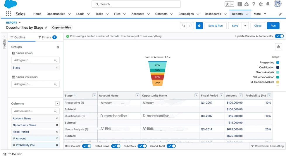
Next, we will construct a report that displays open opportunities categorized by stage and amount. This report will provide valuable insight into the status of open deals and their corresponding values.
Steps:
- Select the Reports tab, then click the New Report button.
- Select the Opportunities report type, then click the Start Report button.
- Click the Filters tab in the report builder, and change these filters: Show Me – All Opportunities, Close Date – All Time, Opportunity Status – Open.
- Click the Outline tab in the report builder, and remove the unnecessary columns by clicking the “x” to the right of the column names you don’t need so that only Account Name, Opportunity Name, Stage, Fiscal Period, Amount, and Probability display.
- Click the drop-down arrow on the Stage column header, and select Group Rows by This Field.
- Click the drop-down arrow on the Amount column header, and select Summarize – Sum.
- Click the Add Chart button near the top of the page and select Funnel, give it a title, and make sure the Show Values checkbox is checked.
- Click the Save & Run button, name it Opportunities by Stage, and click Save.
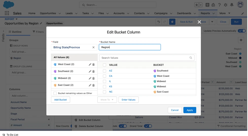
Moving forward, we will create two reports that will assist us in identifying areas where we can invest to generate new sales. The first report will focus on opportunities categorized by region, while the second report will provide insights based on lead sources.
Steps:
- Select the Reports tab, then click the New Report button.
- Select the Opportunities report type, then click the Start Report button.
- Click the Filters tab in the report builder, and change these filters: Show Me – All Opportunities, Close Date – All Time, Opportunity Status – Open.
- Click the Outline tab in the report builder, and remove the unnecessary columns by clicking the “x” to the right of the column names you don’t need so that only Account Name, Opportunity Name, Stage, Fiscal Period, Amount, and Billing State/Province display.
- Click the drop-down arrow on the Billing State/Province column header, and select Bucket This Column.
- Name the bucket Region.
- Click the Add Bucket button and create buckets for each region: West Coast, Southwest, Midwest, East Coast.
- Check the boxes for CA and OR state values, and then click Add to Bucket – West Coast. Do this for each region bucket.
- Click the Apply button.
- Click the drop-down arrow on the Region column header, and select Group Rows by This Field.
- Click the drop-down arrow on the Amount column header, and select Summarize – Sum.
- Click the Add Chart button near the top of the page and select Donut, give it a title, and make sure the Show Values checkbox is checked.
- Click the Save & Run button, name it Opportunities by Region, and click Save.
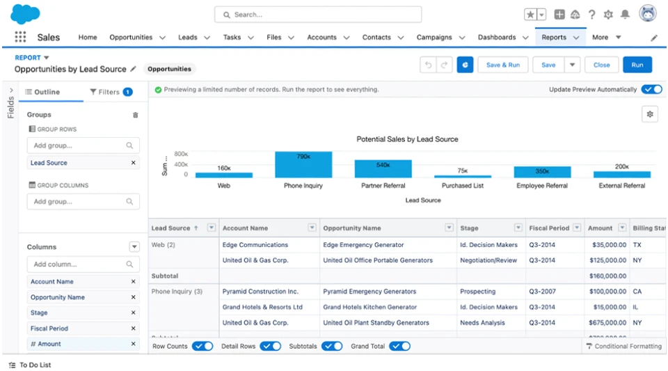
Now, let’s create a similar report to display opportunities by lead source.
Steps:
- Select the Reports tab, then click the New Report button.
- Select the Opportunities report type, then click the Start Report button.
- Click the Filters tab in the report builder and change these filters: Show Me – All Opportunities, Close Date – All Time, Opportunity Status – Open.
- Click the Outline tab in the report builder, and remove the unnecessary columns by clicking the “x” to the right of the column names you don’t need so that only Account Name, Opportunity Name, Stage, Fiscal Period, Amount, and Lead Source display.
- Click the drop-down arrow on the Lead Source column header, and select Group Rows by This Field.
- Click the drop-down arrow on the Amount column header, and select Summarize – Sum.
- Click the Add Chart button near the top of the page and select Column, give it a title, and make sure the Show Values checkbox is checked.
- Click the Save & Run button, name it Opportunities by Lead Source, and click Save.
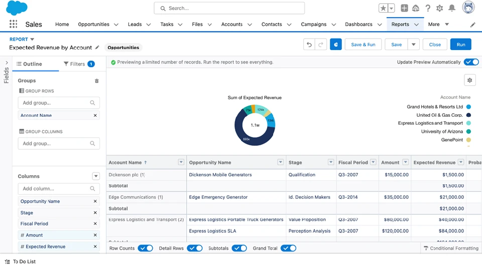
We also want to let the sales team see which customers have the most sales opportunities so the team can focus their attention on those accounts. Let’s create a report that displays opportunities by expected revenue per account.
Steps:
- Select the Reports tab, then click the New Report button.
- Select the Opportunities report type, then click the Start Report button.
- Click on Filters tab in the report builder, and change these filters: Show Me – All Opportunities, Close Date – All Time, Opportunity Status – Open.
- Click the Outline tab in the report builder, and remove the unnecessary columns by clicking the “x” to the right of the column names you don’t need so that only Account Name, Opportunity Name, Stage, Fiscal Period, Amount, Expected Revenue, and Probability display.
- Click the drop-down arrow on the Account Name column header, and select Group Rows by This Field.
- Click the drop-down arrow on the Amount column header, and select Summarize – Sum.
- Click the Add Chart button near the top of the page and select Donut, give it a title, and make sure the Show Values checkbox is checked.
- Click the Save & Run button, name it Expected Revenue by Account, and click Save.
Now that we’ve got all these reports, let’s put them on a dashboard so our sales team can see the data in one place.
Steps:
- Click the Dashboards tab, then the New Dashboard button atop the page.
- Give your Dashboard a name and description, then click Create.
- Click + Component, select the Closed Won Opportunities by Quarter, check the Use chart settings from the report box, and then click Add.
- Click + Component, select the Opportunities by Stage report, check the Use chart settings from the report box, and then click Add.
- Click + Component, select the Opportunities by Region report, check the Use chart settings from the report box, and then click Add.
- Click + Component, select the Opportunities by Lead Source report, check the Use chart settings from the report box, and then click Add.
- Click + Component, select the Closed Won Opportunities by Quarter report, select Display As Number(1 2 3 buttons), and then click Add.
- Click + Component, select the Opportunities by Stage report, select Display As Number (1 2 3 buttons), and then click Add.
- Click + Component, select the Expected Revenue by Account report, check the Use chart settings from the report box, and then click Add.
- Now you can move the components around and resize them to your liking and give them names that will resonate with your sales team, so they know what they’re looking at.
- Click the Save button and name it Sales Team Ideal Dashboard.
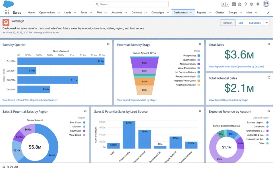
Great! Let’s summarize each component of the Sales Team Ideal Dashboard:
- Sales by Quarter: This chart provides an overview of sales performance across different quarters. It is based on the opportunities by the amount and close date report, giving a visual representation of sales trends over time.
- Potential Sales by Stage: This chart illustrates the distribution of potential sales at different stages of the sales process. It utilizes the open opportunities by amount and probability report to highlight the progress of potential deals.
- Opportunities by Region: This component focuses on opportunities categorized by region. It helps the sales team identify regions that require additional support and attention. The data is derived from the opportunities by the regional report.
- Opportunities by Lead Source: This component displays the sources from which opportunities originate. By analyzing this information, the sales team can gain insights into the most effective lead sources. The data is extracted from the opportunities by lead source report.
- Expected Revenue by Account: This component highlights the expected revenue generated from each account. It enables the sales team to prioritize accounts based on revenue potential. The data is sourced from the expected revenue by account report.
- Total Sales and Potential Sales: This text-based component provides a clear display of the total sales completed and the total potential sales for the year. It serves as a quick reference for the sales team to track their progress and goals.
By incorporating these components into the Sales Team Ideal Dashboard, the sales team can efficiently monitor sales performance, identify areas for improvement, and make data-driven decisions to drive success.

Chinmay Bonde
Marketing Operations Manager
As a Marketing Operations Manager at Cloudalyze, I take care of content marketing, digital marketing, & graphic design. I also have the opportunity to collaborate cross-departmentally to improve internal marketing processes, create marketing enablement strategies, and weigh in on our go-to-market strategy. My life at Cloudalyze allows me to do a variety of things but being able to grow in a Salesforce Partner organization with the best talent and a revolutionary solution is what makes this a labor of love for me. As an operations manager at Cloudalyze, some of the things I look for in my work here is a belief, curiosity, creativity, tenacity, a strong work ethic, provocative thinker, and a strong personality.